

In our our previous post about NBA home court advantage, we saw that home court win percentages varied over the past 21 seasons, but have averaged around 60%.
In this short post, we’ll try to drill a little deeper into the distribution of home court win percentages.
Within a given NBA season, teams vary enormously in quality. From the historical data, we know that an average team (with a 50% win percentage) has roughly a 10% improvement in win probability from playing at home. But what about low-quality teams or elite teams? What does home court advantage look like for teams that aren’t average?
Let’s look at the data and see.
Grouping by Season and Team
Please see this Jupyter notebook for the code used to produce the data, analysis and figures in this post.
We will continue to analyze the 24,797 regular season match ups from the 1996-97 through the 2016-17 regular seasons that we previously scraped. As a reminder, we are using the current NBA team name for historical data, to keep track of team moves and name changes.
If you look at the Jupyter notebook, you’ll see that most of the work is grouping the match up information by season and team so we can look for patterns. Grouping allows us to calculate aggregate statistics for a particular team in a particular season.
Teams change over time, as rosters, coaches and management evolve. Of course, there’s also variation in team lineups intra-season, due to trades and injuries. We will eventually get to the player level of detail, but for now we will focus on the regular season as a reasonable time unit for analyzing a team.
The notebook also splits the home and away games . That way, we can subtract the away game statistics from the home game statistics, controlling for season and team. This will allow us to develop a purer estimate of the impact of home court.
For now, we’re only going to compute win percentages. In future analysis, we’ll apply the same idea to box scores.
Analyzing the Win Percentages
Here is a high level overview of the win percentage and home win percentage, for each team/season pair.
There are 622 distinct team/season pairs. For some of these 21 seasons, there were only 29 NBA teams (prior to the Charlotte expansion).
As required by basic arithmetic, the average NBA team has a 50% win percentage. And we see the same 59.8% home team win percentage from our prior analysis. What’s interesting in this table, though, is the distribution information.
For example, we see that the win percentage has ranged from just over 10% to as high as 89%, and that 50% of the win percentages are between 39% and 61%. To see that, look at the “25%” and “75%” rows in table above. This table shows the quartiles of the win percentage distribution. Quartiles are a particular example of quantiles.
The 25% and 75% quantiles of the home win percentage distribution are roughly 49% and 73%. These also happen to be roughly 10% higher than the corresponding win percentage. So, how correct is it to simply add 10% to any NBA team’s win percentage to predict their home win percentage? Or conversely, how correct is it to subtract 10% from any NBA team’s home win percentage to predict their overall season win percentage?
An Interesting Figure
Since a picture is worth a thousand words, let’s answer this question with a picture.
The figure below shows a scatter plot of each team/season pair. The x-axis is the team’s home win percentage for that season, and the y-axis is the team’s overall win percentage for that season. The markers are colored based upon the team’s relative performance in that season. As noted in the legend, top quartile teams are colored grey, and bottom colored teams are colored pink.
This figure was generated in the accompanying Jupyter notebook. Please refer to the notebook to see the Python code that produced it.
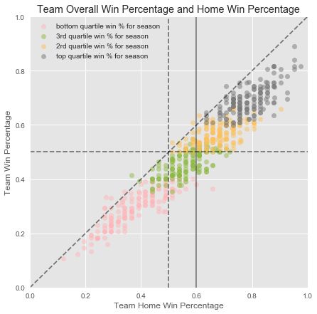
The figure has 4 lines overlaid to help in the interpretation.
The horizontal dashed line divides the plot into team/season pairs with overall winning records in that season.
The vertical dashed line divides the plot into team/season pairs with better-than-even home win percentages in that season. As you would expect, most of the observations fall to the right of this vertical line.
There are some bottom-quartile teams with winning home records, and there are some third-quartile teams with losing home records.
As a curiosity, look at the team sticking out on the lower-right. This team had a better than 65% home win record, but was sub-40% overall. Who was it? The 2002-3 Chicago Bulls, with their franchise-worst 3-38 road record. They got 27 of their 30 wins at home.
The vertical solid line shows the location of the home win percentage average for all teams and seasons (59.8%).
The diagonal line has slope 1, and is where the team win percentage equals the home win percentage. In other words, teams on this line had no observable home court advantage in that particular season.
In fact, we see that there are a few teams which had worse home records than overall records. Here is a list of the 11 times where that occurred.
Conclusion
There is clearly a strong association between a team’s home win percentage and the team’s overall win percentage. The 10% extra home win probability rule of thumb is reasonable for an average team. However, there is a lot of variation around the averages.
Moving along the horizontal line, we see that a team with an average win percentage could have anywhere from a below-average (50%) to a good (70%) home win percentage.
Similarly, moving along the dashed vertical line, we see that a team with a below-average 50% home win percentage could either have an average season (50% overall) or a horrific season.