

This post continues where our previous post on NCAA first round upsets left off. We will look at Ken Pomeroy’s KenPom college basketball ratings and see how they can help us predict wins and losses. By combining the KenPom data with the NCAA tournament game history from our previous post, we’ll see whether the KenPom data would have helped predict first round upsets in previous NCAA tournaments.
Ken Pomeroy is the creator of some of the most widely-followed statistics in college basketball. His site provides ratings for all 351 NCAA Division-I men’s basketball teams. Pomeroy started creating his ratings back in 2002. The methodology has evolved over the years (with the most recent revision in 2016). You can read more about how KenPom became one of the most influential providers of college basketball rankings here and here.
This is a long post. First, we’ll spend some time understanding what the various KenPom ratings mean. Then, we’ll explore different ways historical KenPom data could have been used to predict upsets in previous NCAA tournaments. The idea is that if KenPom data would have been useful in predicting upsets in the past, it might be predictive going forward in making picks for future tournaments. We’ll create some interesting visualizations of historical KenPom win probabilities and related data, to see whether there are useful patterns in the upsets that have occurred in prior tournaments.
As you’ll see in more detail later in the post, I am using the freely-available KenPom data, which have some potentially significant limitations for our purposes. I’ll point out where the analysis could give misleading results. It’s still useful to do the analysis and try to understand the limitations of the data. If I am able to obtain better data, I will revisit the analysis in a future post.
As usual, the code and much of the text for this post can be found in a Jupyter notebook. See “How To Do This Yourself” at the end of this post for more details.
Understanding KenPom Ratings
KenPom ratings are intended to be predictions of how teams will perform in the future. They don’t try to explain why teams won in the past.
You can read the definitions of the KenPom ratings in this glossary. Since the ratings are produced using a proprietary methodology, we can’t look inside the black box to see exactly how they are created.
As previously noted, the methodology was revised in 2016, so see here also to learn about the ratings available on the current version of the site.
We will use the freely-available data on the site for NCAA seasons going back to 2002. As you’ll see below, there are some important caveats about using the historical data.
Adjusted Offensive and Defensive Efficiencies
The main building blocks are Adjusted Offensive Efficiency Rating (AdjO) and Adjusted Defensive Efficiency Rating (AdjD).
AdjO is a prediction of the team’s points scored per 100 possessions, against an “average” team on a neutral court. KenPom defines “average” as being an average Division-I opponent.
AdjD is a prediction of how many points per 100 possessions an average opponent will score against the team on a neutral court.
Equivalently, if you divide either rating by 100, it’s the predicted points scored by or against the team per possession.
Note that KenPom uses an assumption that home court advantage is worth 3.75 points in estimating the ratings. Since NCAA tournament games are played on neutral courts, no home court adjustment is made for predicting tournament games.
Adjusted Efficiency Margin
The Adjusted Efficiency Margin (AdjEM) is simply the difference between the offensive and defensive efficiency ratings for the team. It can be positive or negative. If it is negative, it could be because of relatively weak offense or relatively weak defense.
KenPom Ranking
In the KenPom methodology, teams are ranked by their AdjEM.
Virginia is the top team as of Sunday, March 11 (and a first seed in this year’s March Madness), with an AdjEM of +32.15. This is composed of a 116.5 AdjO less its 84.4 AdjD.
Notice that Virginia’s AdjO is only ranked 21st, while it’s AdjD is ranked number 1. In contrast, the number 2 team, Villanova, has the top KenPom AdjO of 127.4, but only the 22nd ranked AdjD of 96.0.
Tempo
Notice that by estimating points scored or allowed per possession, the KenPom methodology controls for the effect of team pace. In any particular game, both teams get roughly the same number of possessions. This is true whether one or both teams push the ball up the floor or not. You can read Ken Pomeroy’s own post on possessions here.
If you want to predict scores or point differentials, you need to include the effect of pace.
Fortunately, KenPom also helps to predict pace. The Adjusted Tempo (AdjT) is a prediction of the number of possessions the team will have against an “average” team on a neutral court.
If you want to estimate the number of possessions each team will have in a given game, you can just average the AdjT of each team.
So, for example, if Virginia (AdjT of 59.2) were to eventually meet Villanova (AdjT of 68.3) in the 2018 NCAA tournament, KenPom would predict that there would be 127.5 possessions in total (each of average length 18.8 seconds), or equivalently that each team would have roughtly 64 possessions per game.
Strength of Schedule Ratings
The strength of schedule (SOS) ratings can be used to get a sense of the average quality of opponents that a team faces during a given season.
The SOS AdjEM is the AdjEM of a hypothetical team that would be predicted to win half of its games against the team’s full-season schedule (excluding post-season play).
The non-conference strength of schedule measure (NCSOS AdjEM) is similar, except that it only looks at the team’s non-conference opponents.
Luck
The KenPom ratings glossary describes the luck rating as:
A measure of the deviation between a team’s actual winning percentage and what one would expect from its game-by-game efficiencies. It’s a Dean Oliver invention. Essentially, a team involved in a lot of close games should not win (or lose) all of them. Those that do will be viewed as lucky (or unlucky).
You can read more about Dean Oliver and his contributions to basketball analytics here.
Theoretically, once a game is close and goes down to the wire, an average team should win roughly 50% of the time. The luck rating is just measuring historically whether teams have won (or lost) a meaningfully different fraction of these close games.
You can interpret the luck rating in two completely different ways.
- Teams with high luck ratings have an ability (not captured by other KenPom ratings) to “win in the clutch.” You should expect those teams to continue to be “lucky” relative to their regular KenPom projections.
- Teams with high luck ratings just got very lucky in the past, and you shouldn’t rely on that luck to continue in the future in close games. Maybe those teams aren’t as good as their records suggest?
You can read about what one researcher learned about these questions here and here. His conclusion was that you should go with the second interpretation, and be wary of teams with high luck ratings.
Ranks
The KenPom data also has the ranks of each team measured by every statistic. We won’t use the rank data in this post.
One Caveat with Historical KenPom Data
The KenPom data for 2002-2017 that are used in this notebook are as of the end of the respective seasons, and include post-season play. This could be problematic for studying historical NCAA tournament results, since the KenPom ratings include the teams’ performance in those tournaments. To run a correct analysis, you want to have the KenPom data as it appeared just prior to the tournament start each year. If the tournament results meaningfully changed the final KenPom ratings compared to how they appeared right before tournament, our prediction model would be biased by using the “incorrect” KenPom data.
Furthermore, the methodology behind KenPom data changed in 2016. The “historical” data shown on the KenPom website for seasons prior to 2016 were computed using the new methodology. Even if we had the KenPom data as it stood just before the previous tournaments, it wouldn’t be consistent with how the KenPom data are computed today. To make sure our analysis is using apples-to-apples data, we would need to be sure to get KenPom data, computed using the current methodology, using historical games up to but not including the NCAA tournaments in each year.
Unfortunately, we don’t currently have access to such data, so we will use the data we have. This is equivalent to assuming that the final post-season KenPom ratings (computed using the current methodology) in prior years wasn’t too different from how it would have looked just prior to the tournaments.
A team plays at most 6 games in the NCAA tournament, and most teams play much fewer than that. Since the KenPom data are based on the entire season, which includes many more games, you might hope that errors introduced by this assumption would be relatively small. We’ll proceed with the analysis but we need to keep this potential source of error in mind.
Comparing Historical KenPom Ratings and NCAA Tournament Seeding
Let’s look at the average values of the KenPom ratings by seed in the 2002 through 2017 NCAA tournaments.
We observe the following patterns in the above table:
- Higher seeded teams tend to have better (lower) KenPom rankings and better (higher) AdjEM ratings.
- The same pattern applies to the underlying AdjO and AdjD ratings. Higher seeded teams have better (higher) AdjO ratings and better (lower) AdjD ratings.
- There does not appear to be a significant pattern in tempo, as shown by the AdjT ratings.
- There does not appear to be much of a pattern in the luck rating by seed, although the fact that most seeds have positive average values suggest that these teams have slightly higher win percentages than the underlying KenPom ratings would have projected.
- Higher seeded teams appear to have played against stronger opponents overall prior to the tournament, although there does not appear to be a pattern in the non-conference SOS ratings.
First Round Upsets and KenPom Ranks
Let’s take a quick look at how many upsets occurred during the 2002-2017 first round games. In our prior analysis on first round upsets, we used NCAA tournament data going back to 1985, when the modern 64-team format started. We should make sure that the 2002-2017 sub-period isn’t very different from the full data set before we delve too deeply in our analysis.
Here are the relatively frequencies by which a lower seeded team beat a higher seeded team in the first round of the 2002-2017 NCAA tournaments.
| Higher Seed | Upset Frequency |
|---|---|
| 2 | 0.062 |
| 3 | 0.125 |
| 4 | 0.188 |
| 5 | 0.422 |
| 6 | 0.438 |
| 7 | 0.359 |
| 8 | 0.406 |
For the most part, these upset frequencies aren’t significantly different from the full 33-year period. The eighth seed upset frequency above is 40.6%, whereas in the full 33-year period it’s 49.2%. However, as we discussed in the earlier post, the 8-9 game is never really an upset in the correct meaning of the word, so this shouldn’t concern us too much. It’s unlikely that there was a meaningful change in the probability of eighth seeds winning these games after 2002 compared to previously.
Overall, there are 128 “upsets” (again, including the 8-9 games) in our data set of first round games since 2002.
On the other hand, there are 62 cases where the better-ranked team (by KenPom) was not the higher seeded team in the NCAA tournament first round game. (Let’s call this situation a “KenPom inversion”, since the KenPom ranking appears backwards relative to the tournament seeding.)
Let’s look at how upsets overlap with KenPom inversions. In the table below, “0” signifies No/False, and “1” signifies Yes/True.
Look first at the “1” column for KenPom inversions. Of the 62 times a team with higher KenPom rank was seeded worse in the tournament, 42 (or more than 
That seems promising. If you see a matchup between teams where the tournament seed and KenPom rankings are inverted, it would suggest you have much better than even odds going with the KenPom ranking in picking the winner.
On the flip side, however, look at the “1” row for upsets. Of the 128 upsets, only 42 (or roughly 
In other words, conditional on seeing a KenPom inversion, an upset is more likely than not. However, if you only focus on KenPom inversions, you’ll miss a lot of potential upsets.
We can shed more light on this by looking at the distribution of upsets and KenPom inversions by the seed of the higher seeded team.
We see that the KenPom inversion is only relevant for the fifth seed or below, and is much more common in the 7-10 and 8-9 matchups. This makes sense, as it’s clearly more likely that NCAA seeding would diverge from KenPom rankings for the middle-quality teams.
We can slice the data more finely to better see where the KenPom inversion might be useful in predicting upsets.
The chance of picking an upset simply using inverted KenPom rankings appears to be most favorable for sixth and seventh seed games. For fifth seed and eighth seed games, the impact doesn’t seem as powerful.
An Important Note on NCAA Tournament Selection, Seeding and Picking Upsets
There has been a long and fierce debate about the methods and inputs the NCAA tournament committee has used to select teams for March Madness over the years. You can read about the history and some of the issues here, here and in the underlying linked articles. This year, the committee has modified its process to include additional data, including KenPom, into the selection decisions.
I raise this issue here because it’s important to note that one reason why KenPom rankings and tournament seeding divered in prior years may have been due (at least in part) to the fact that the tournament committee didn’t look at KenPom data. This year, the committee will be looking at many new pieces of information, of which KenPom will be a part.
The point is, the selection process itself is an input into the likelihood of an upset. If the selection and seeding process changes dramatically, historical data may be less useful in picking upsets going forward. This is something to keep an eye on as the committee continues to modify its process going forward.
Repeating the Caveat about the Historical KenPom Data
Also, keep in mind that the historical KenPom data include the impact of the NCAA tournament. Suffering an upset in the first round could negatively affect its KenPom ranking, perhaps lowering it enough to actualy cause the inversion in KenPom rankings. If this occurred, rather than predicting the upset, the KenPom inversion would be because of the upset.
Until we obtain pre-tournament historical KenPom data, we can’t verify whether this situation actually occurred often enough to matter. So please keep in mind that the “KenPom inversion” effect observed may ultimately turn out to be a spurious side effect of the data set were’ using.
Making Predictions with KenPom Data
Let’s see how to use the KenPom data to estimate win probability.
The procedure is relatively simple:
- Estimate the number of possessions in the game for each team.
- Estimate the points per possession differential between the two teams.
- Estimate the point spread as the product of the number of possessions per team and the points per possession differential.
- Convert the point spread into a win probability.
Let’s go through this one step at a time.
Estimate Possessions Per Game
Each team has its own Adjusted Tempo measure. Simply average these two tempo measures to estimate the number of possesions each team has (which are assumed to be equal).
Estimate Points Per Possession Differential
If we want to predict the offensive output of a team, we need to consider both the team’s offensive efficiency and its opponent’s defensive efficiency. If the opponent has a good defense (i.e., a low AdjD), that should drag down the team’s offensive production compared to an average opponent. On the other hand, versus a bad defense (high AdjD), the team might put up even better offensive numbers.
Since each team’s AdjEM is the difference between its own offensive and defensive efficiencies, it turns out that the estimated points per possession differential is just the difference of the efficiency margins for each team.
Estimate Expected Point Spread
To get a spread measured in points, just multiply the points per possession differential by the number of possessions per game.
Estimate Win Probability
Sometimes, the point spread is interesting information in and of itself (for example, if you are comparing the KenPom estimate to a betting line).
Under the KenPom framework, the team with the higher effiency margin is expected to win the game. This is true whether the predicted point spread is 0.1 points or 20 points. To convert the point spread into a win probabilty, use the following rules:
- Divide the point spread by 11 points (see here and here)
- Take this scaled value and plug it into the standard normal cumulative distribution function
- The result is the estimated win probability
A Quick Example: Virginia vs. UMBC
Let’s look at the upcoming first round matchup between Virginia and UMBC, using KenPom data as of Monday, March 12, 2018.
| KenPom Rating | Virginia | UMBC |
|---|---|---|
| Adj Tempo | 59.1 | 68.1 |
| Adj Off Eff | 116.5 | 103.3 |
| Adj Def Eff | 84.4 | 105.3 |
| Adj Eff Margin | +32.15 | -1.99 |
From these KenPom values, we see that the predicted possessions per game is 63.66 for each team (about 18.9 seconds per possession).
The efficiency margin differential is 34.14 points per 100 possessions in favor of Virginia. This leads to a KenPom prediction that the Cavaliers should beat the Retrievers by 21.7 points (3.414 points per possession 
In order to compute a win probability, you need a way to compute the standard normal cumulative distribution function. You can compute this in Microsoft Excel or Google Sheets using the NORMDIST() function. Or, to see how to compute this easily in Python, please see “How To Do This Yourself” at the end of this post for more details.
You can also use this free online calculator. Just plug in 0 for the mean, 11 for the standard deviation, and the point spread for x (in this example, 21.7).
The answer is approximately 0.9757.
The KenPom method predicts that Virginia has greater than 97.5% probability of advancing to the second round.
Analyzing Historical Upsets with KenPom Win Probabilities
Let’s look at the range of predicted first round NCAA tournament win probabilities for the 2-15 seeds in our historical KenPom data. Remember the caveat that these win probabilities are probably affected by the fact that the KenPom data were retroactively calculated, and include NCAA tournament game results in the calculations.
Not surprisingly, the average win probabilities drop steadily as a function of the seed.
There is quite a range in the values by seed, however. Let’s focus on the 5 seeds, for example. The average KenPom win probability since 2002 is about 65% for that seed. However, the KenPom win probability has been as low as 43.5% (i.e., expected to lose) to as high as 84.4%.
Maybe KenPom win probabilities can in fact suggest reasonable upset picks. Let’s explore further.
Visualizing Win Probability Distributions by Seed
We can create a violin plot to better understand the distribution of win probability by seed. A violin plot is shows the frequency distribution of data organized by category. We can organize the data by seed and whether the game was an upset or not, and see if there is a pattern in the KenPom win probability distributions.
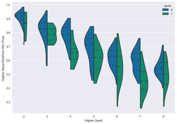
A few things are immediately clear from this plot:
- Overall, the win probabilities slope down and to the right, since win probability drops for lower seeds.
- The green distributions (where an upset actually occurred) are lower than the blue distributions (where no upset occurred).
- There is substantial overlap between the green and blue distributions, so KenPom doesn’t do a perfect job of identifying upsets. Far from it. But, if you focus on the dashed lines in the distributions (which represent the 25%, 50% and 75% quantiles of the distriubutions), you’ll see that there is a noticeable distinction between the upset and non-upset distributions.
Visualizing Upsets and Efficiency Margin Differences
The KenPom win probability is a function of the difference between the teams’ efficiency margins. We can also look at those efficiency margins directly. The story isn’t really that different, as we’ll soon see. But, since the efficiency margins are relatively easy to understand, it may help your intuition to look at the data from this perspective.
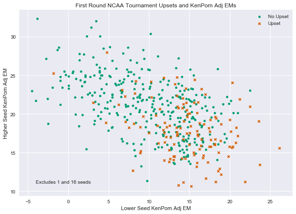
The upsets (marked with ‘x’ for each data point) are clearly skewed to the lower right relative to the non-upset dots. Upsets have tended to occurr more often when the lower seeded team has a relatively high KenPom AdjEM, or where the higher seeded team has a relativley low KenPom AdjEM. Of course, this is just another way of saying that the higher seeded team has a lower KenPom win probability.
A More Detailed Visualization by Seed
The overall picture makes it clear that KenPom data should be somewhat useful in predicting first round upsets. However, it’s important to look at the results in more detail by seed.
Let’s decompose the scatter plot above into 6 plots, one for each seed 3 through 8. We will skip the second seed games since there are so few upsets.
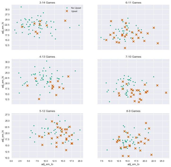
These plots show that there is a lot of noise under the surface, and that we should be cautious about relying on KenPom data in picking upsets. Although the overall patterns make sense, the historical predictive accuracy by seed is mixed. And of course, the data set is relatively small.
Logistic Regression Plots
Let’s look at the distribution by seed in another way. We can use the logistic regression plotting functionality in the seaborn package to visualize the estimated upset probability as a function of the KenPom efficiency margin difference, by seed.
We won’t try to explain the math behind logistic regression here. That will need to wait for future posts. The main idea is it tries to predict the value of binary variables (taking the value 0 or 1) based on the values of other variables. In our case, the binary variable is whether the upset occurred or not. The predictive variable (we hope) is the KenPom efficiency margin difference between the teams.
Using a Python package, we can create the plots and simultaneously have the package estimate the logistic regressions for us. Please see “How To Do This Yourself” at the end of this post for more details.
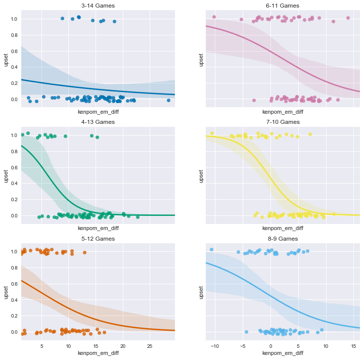
In these plots, the upsets are the dots with the value ‘upset’ equal to 1, while the 0 values are the non-upsets. The curved lines (with the surrounding shading) are the estimated probabilities of an upset, given the value of the KenPom efficiency margin difference immediately below the curve.
For example, for the 4-13 game, if the KenPom efficiency margin difference is 5, the estimated upset probability is about 60%. On the other hand, if the KenPom efficiency margin difference is 10, the estimated upset probability is only about 20% for the 4-13 game.
You can see that the model doesn’t ever predict a high upset probability for the 3-14 games. The message is similar to the scatter plots we saw above. The model is more confident predicting upsets in the 4-13 games than in the 5-12 games (since the probabilty curve gets to higher values). Don’t be too confident in this result, however. The data set is quite small and this could be the result of noise, or the KenPom data caveats we’ve discussed previously.
In any case, if you are inclined to pick upsets, this analysis shows you how to make the best possible use of the available KenPom data in making your picks.
How To Do This Yourself
You can see how to scrape the historical KenPom rating data by looking at this Jupyter notebook.
You can see how to scrape the historical Washington Post NCAA tournament data by looking at this Jupyter notebook. We previously scraped this data set and did some preliminary analysis in our prior post on NCAA first round upsets.
All of the code to load the data, run the numbers and generate the visualizations can be found in this Jupyter notebook.
This notebook has a lot more detail on some of the data quality and preparation issues that always crop up in real-world data analysis. In this case, one challenge is that the Washington Post and KenPom sites use different names and abbreviations for many of the schools. The notebook shows how to identify and clean up the data, and merge it into a useful form.
The notebook repeats a lot of the text of this post, but it also has some of the algebra that I left out of this post explaining how to use KenPom ratings. It also shows a simple way to code the cumulative normal distribution function in Python. Please see the notebook for more details.